


Project Type:
Student Project at Springboard
My Role:
End-To-End Product Design
Applications Used:
Figma, Miro
Platform: Mobile Duration: 5 Days
About
CoSpot is an app that helps remote workers discover and navigate to the best coworking spots with helpful features such as crowd meters, information on available power outlets, and much more.
This project was completed as part of a Google Ventures design sprint for Springboard, and I worked independently using primary research from BiteSize UI to come up with potential solutions to a predetermined problem.
The Problem
Remote workers have trouble finding adequate spaces for work, as many navigation apps fall short to provide them with the information they need. As a result, they feel frustrated and spend valuable time digging through multiple apps to no avail.
The Goal
From the research given to me, I wanted to figure out what the most significant pain points were for remote workers and then design a streamlined experience that would give them the information they needed as quickly as possible.
The Solution
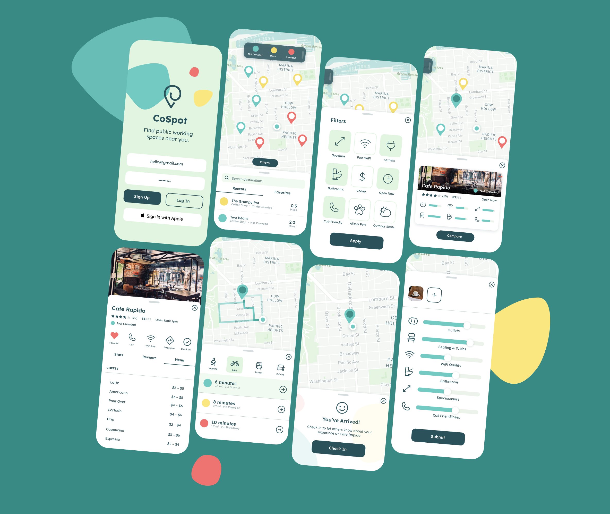
I designed an experience that provides vital information such as crowdedness, outlet availability, and wifi accessibility from the first screen upon opening the app, as well as a location side-by-side comparison feature.
Methodology
This project was a modified Google Ventures design sprint, with the primary research for the project already conducted by Bitesize UX. After synthesizing the research, I followed the following five-day design sprint structure:

Provided Research
Walkthrough
Bitesize UI gave me a lot of primary research, including a persona and a pre-recorded user experience walkthrough.
In the walkthrough the usability tester attempted to find a place to work remotely with current apps. She quickly became frustrated as she spent time using multiple products to find information relevant to her needs.
Persona
Nina, our persona, is a 32-year-old freelance copywriter in Boston. Her schedule is unpredictable because her clients and deadlines change constantly. Often caught downtown between meetings with too little time to return to her home office, she needs to find spaces available for short spurts of productivity.
Day One: Ideation
User Priorities
After reading through my research, I determined our target user values proximity, time efficiency and crowing the most when searching for a coworking location.

Solution Maps
With those pain points in mind, I quickly made three solution maps that could address those needs effectively.
I ultimately chose a solution I labeled “Heatmap-First with Compare” as it provides Nina with all necessary information the earliest in the flow: location proximity and crowd level are immediately visible through a heatmap on the first screen.
She can also select multiple locations at once and easily compare them to avoid toggling between individual location detail pages.

Day Two: Sketching
Competitive Analysis
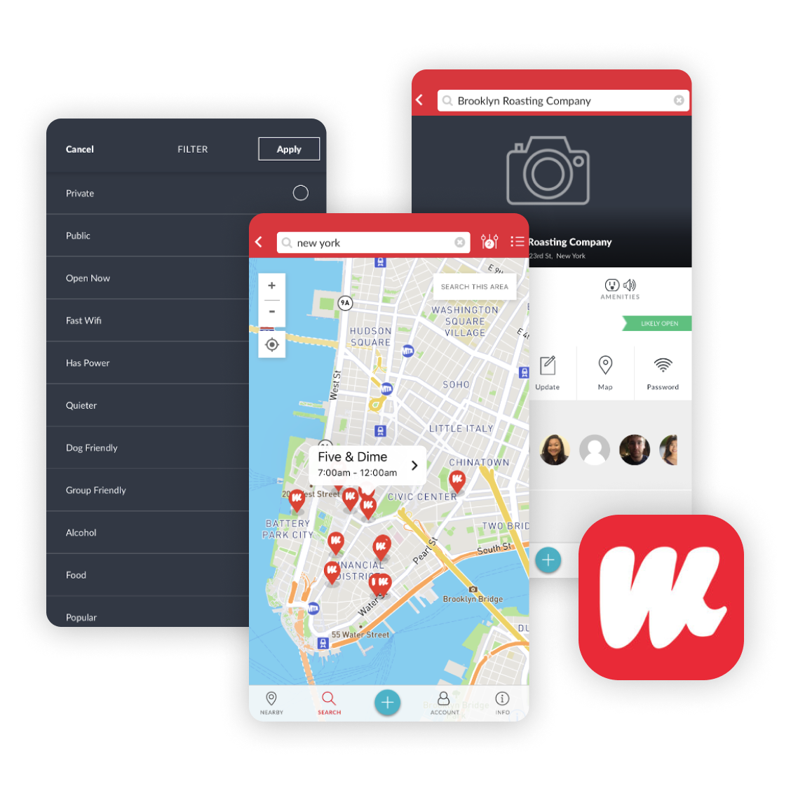
Before I started sketching solutions, I decided to do lightning demos to find inspiration from existing products such as Google Maps, Croissant, and WorkFrom, and how well they address our persona’s pain points.

Google Maps
Although Google Maps is useful for finding places, it is not the best tool for discovering Coworking spaces, as there is too much information to sort through.
While you can find information on fast wifi and laptop space, it often requires going through many pages and tabs. However, Google Map’s "Popular Times" feature is great for determining how crowded a space is.

Croissant
Croissant is an app that allows you to reserve a seat at any paid coworking space. While its map view is similar to that of Google Maps, its filters are not very specific. Granted, the spaces Croissant offers are already tailored to be prime coworking spaces, but the only options you can filter by are date, time and seats available. You also cannot gauge if a space is fully booked or not.

Workform
Workfrom is an app that is designed specifically to locate free and public coworking spaces. While its map view and quick previews are not as detailed as other apps, Workfrom compensates for this on their location's landing pages. On these pages, users can find useful information like WiFi speeds and outlet availability without being overwhelmed with excessive detail.
Fleshing Ideas Out
The Most Important Screen, Eight Ways
I chose to sketch the location detail view in my user maps in eight different styles to quickly ideate how I want to stylize and structure my app. This page was the most important to nail down first, as the user would use this page to determine is a space is fit for working or not.
Expanding the Flow
I chose the upper-right concept because it displayed the most information at first glance, enabling the user to quickly absorb location details. I proceeded to build out the flow with two more screens:
Day Three: Decide
Storyboarding
Refining My Sketches
Now that I had landed on a visual solution that I felt comfortable would satisfy my users’ needs, I developed a 15-screen storyboard that shows the complete journey I brainstormed in my solution maps.
The Journey
Drawing inspiration from my competitive analysis, this flow allows the user to:
Sign up
View location crowdedness immediately with a heatmap
Filter locations by wifi, bathrooms, power outlets and more
Browse and compare locations’ features side-by-side
Navigate to a location
View location details
Provide a review with photos
Day Four: Prototyping
High-Fidelity Designs
Once I finished my storyboard, I imported my sketches into Figma and produced high-fidelity mockups of every screen. Using Figma's built-in prototyping features, I then created a clickable prototype to begin user testing.
Day Five: Test & Refine
Interviews
Recruiting and Testing
I interviewed five people I recruited from social media who frequently use public restaurants/cafés to work. I then conducted scripted interviews over Zoom using my Figma prototype to identify any pain points or confusion while browsing through and navigating to a coworking space.
Findings
The most common pain points mentioned by my users were:
Difficulty in viewing the crowd meter
Understanding the overall iconography, especially for “filters” and “bathrooms”
Comprehension of color usage
Final Design Changes
Quick Decisions
Usually, I would conduct a second round of testing, but due to time constraints I proceeded directly to my final designs with this feedback.
Addressing Pain Points
To address the main pain points found in my usability testing I:
Made a larger and high-contrast floating key for the crowd meter that can be swiped in and out of the UI to not obstruct the map view.
Replaced the filter icon with a prominent, legible button labeled "filter".
Reserved specific colors to only represent crowdedness, while using transparency to differentiate other information such as alternate map routes.
Conclusion
This sprint required quick decision-making and resourcefulness, which was a good practice in and of itself. What I found most interesting though was how common comprehension and visibility issues were during my usability testing.
Moving forward, I will certainly be extra mindful of scale, contrast and recognizability in my future designs — even if under a time crunch.
It's encouraging to hear that my usability testers said they would prefer to use the app to find coworking spaces if it were developed, especially considering the surprising lack of similar apps on the market.