Project Type:
Student Project at Springboard
My Role:
End-To-End Product Design
Applications Used:
Figma, After Effects
Platform: Mobile Duration: 50 Hours
About
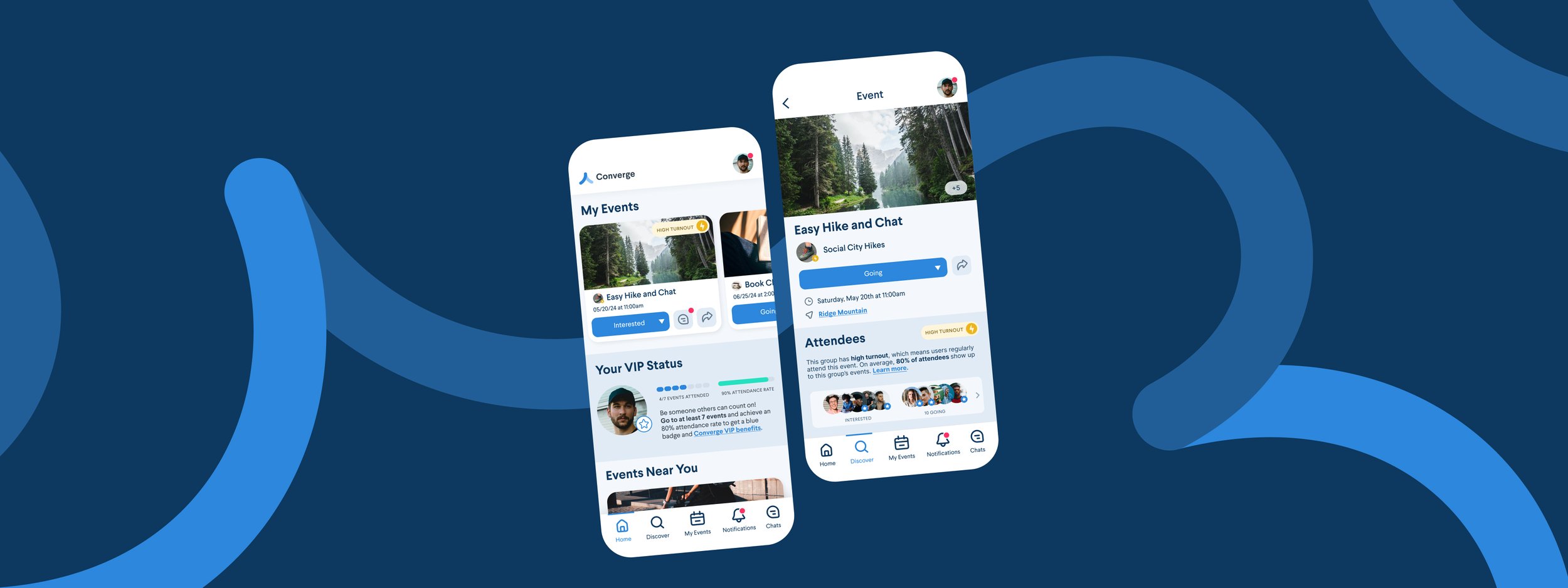
Converge is an MVP that just launched, aiming to help people meet new friends by offering a platform for users to connect, find groups around common interests, and attend events together in-person.
This project was part of my UX/UI education at Springboard, a part-time online learning platform. This was my second capstone, in which we were responsible for the entire product design, from research to conception, visualization and testing.
The Problem
The Converge business team has identified that 20% of those who say they will attend an event don’t show up. At its core, this problem is our behavior of not following through, or “flaking” on events we say we’re going to.
The Goal
Firstly I would like to understand the psychology of why users are not showing up to the events they committed to, and with that data discover ways to increase the actual turnout of attendees who commit to going on the Converge app.
The Solution
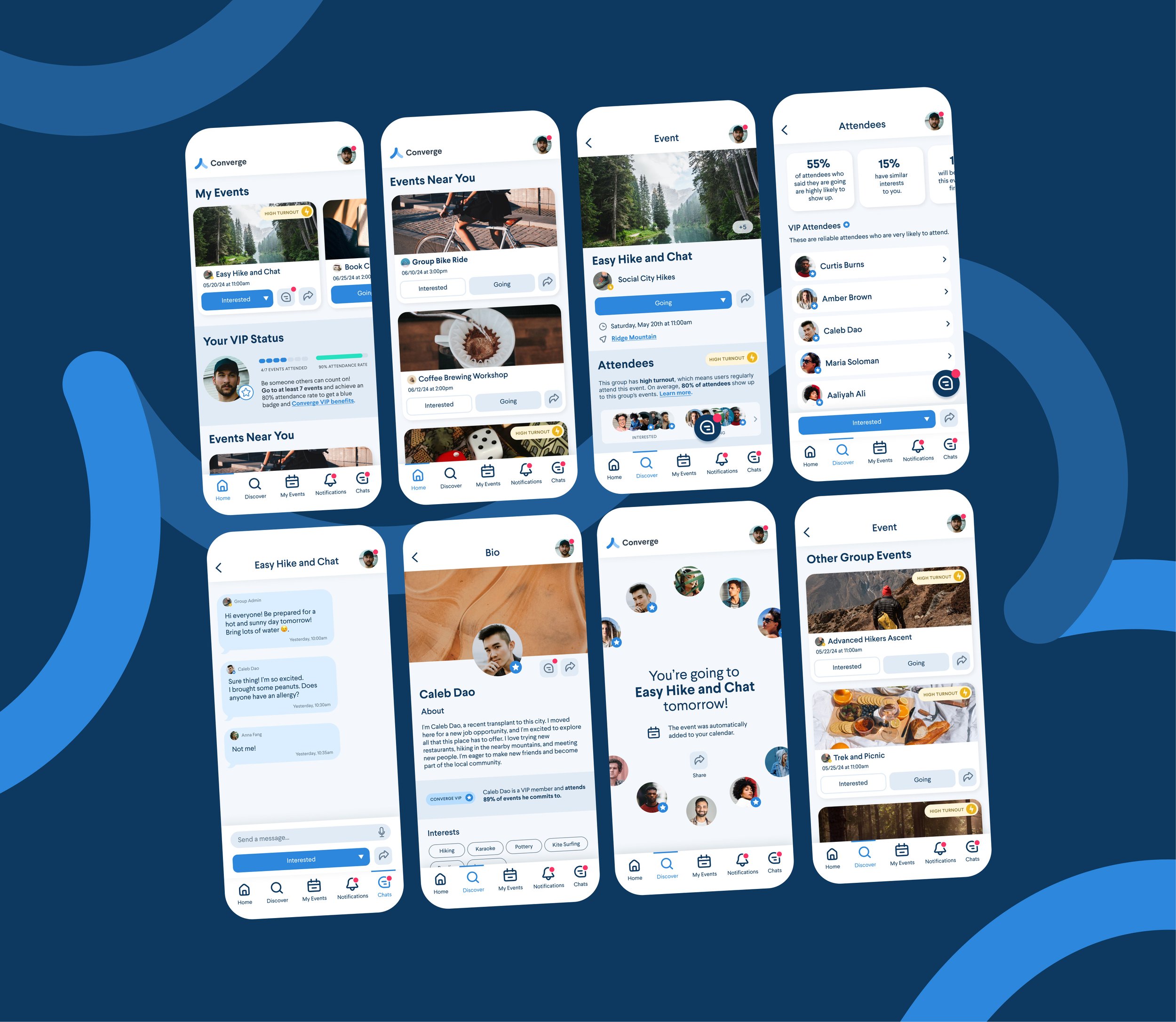
I implemented a system that tracks users’ and groups’ attendance rates to events, publicizes them, and rewards them with dedicated badges to signify they are reliable if they meet certain criteria. I also implemented an automatic add to calendar function.
Methodology
To solve this problem, I used the Design Thinking process of “Empathize, Define, Ideate, Prototype, and Test.”
To empathize with users, I conducted secondary research to understand user psychology and pain points. To define the problem, I synthesized my data and created personas. To ideate, I created sketches and user flows. Finally, I created a prototype with high-fidelity screens and performed two rounds of usability testing.
Why Do We Flake?
What is flaking?
In the United States, we often use an expression called “flaking” to describe when people don’t follow through on an event that they previously committed to.
The Mind of the Flaker
To be a “flaky” person is never a good thing, however, my secondary research shows what is going on from the “flakers” perspective. After perusing many articles and studies online, people fail to attend events due to:
How Competitors Address Flaking
Competitive Analysis
It is safe to assume that other marketplace competitors also run into issues ensuring that attendees follow through on their commitments. To draw inspiration from others’ insights, I performed a competitive analysis on Facebook Events, MeetUp and Eventbrite’s event booking flows.
Competitors’ Features That May Reduce Flaking
Tiered pricing for paid events
Automatic add to calendar
Chat section on event pages
Attendees’ profile images and bios
Incorporate an “Interested” button alongside a “Going To” button to further differentiate higher-interest from lower-interest attendees.
Map view in search and on event pages
These features all include elements of, trust-building, information accessibility, and user differentiation.
Who Exactly Is Flaking?
From this data I determined the most common behaviors behind flaking were forgetfulness, lack of conscientiousness and social anxiety.
These behaviors could paint a picture of two distinct personas: Tyler, the “overextender” and Justine, the “overthinker”.
Finding Solutions
After boiling down my research into two main personas, I thought of some questions to guide myself in brainstorming solutions.
How might build trust with users that the events they commit to are worthwhile?
How might we effectively remind attendees of their upcoming events?
How might we minimize any anxiety users might feel before attending an event?
How might we incentivize users to attend events they’ve committed to?
Building Awareness & Accountability
Time-Efficient Decisions
From digital wallet tickets to placing public wagers on events, I thought of many possible solutions, but since Converge is a MVP and has limited time and resources to make changes, I chose the simplest solution that would have the most impact.
I implemented a system that tracks users’ and groups’ attendance rates to events, publicizes them, and rewards them with dedicated badges to signify they are reliable if they meet certain criteria. Additionally, I implemented an automatic add to calendar at checkout feature I’ve seen in competitors’ apps.
Sketches and User Flows
Before materializing these features into a prototype, I sketched out what they could look like in a user flow diagram as well as some traditional iPad sketches.
Testing Phase One
Med-Fi Prototyping
I created a medium-fidelity prototype in Figma to determine if users could identify how the badging and reliability system works, as well to test out general usability for building high-fidelity prototypes.
I interviewed 5 users over Zoom I recruited from social media who have used an event booking app in the past.
My Findings
Users created negative biases towards users that did or didn’t have the reliability badges, which in turn may de-incentivize users from using the app due to fear of judgment.
The reliability badge’s checkmark icon confused users, as they frequently assumed that it signified users were going to an event rather than being reliable.
The reliability status indicator’s metrics were confusing to users even after they read the description under the bar.
Branding and Visual Identity
After gathering some learning from my medium-fi prototype, I went ahead and created a name, branding, color scheme and UI for Converge that speaks to its users’ needs. I ensured it felt simple, inviting and content-first.

Interactions
Interactions feel smooth and cohesive to encourage users to interact and explore features within the app.
Testing Phase Two
Hi-Fi Design Changes
As I was building out the branding and high-fidelity prototype for Converge, I affected some changes that hopefully would address the issues I found in my first round of testing:
I renamed “Reliability Status” to “VIP Status” to mitigate the assumption that non-badged users are not reliable.
I changed the checkmark icon in the badge to a star so users wouldn't confuse it with attendance status.
I changed the status visual on the homepage from a bar to progress dots to better communicate the criteria needed to get a badge.
My Findings
Users still do not understand what an Active Group is until they click into the event page.
Some users thought their VIP status on the home page was a score that is a percentage of how often they attend events.
Users did not understand what events belonged to which group organizers.
Final Design Changes
To address the issues from my second round of testing I made some design changes:
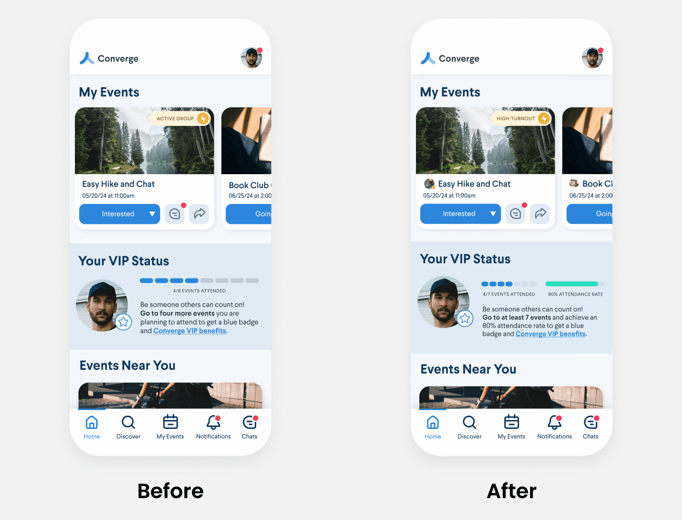
Changed “Active” groups to “High Turnout” groups to more accurately reflect the nature of the group.
Provided further details of users’ VIP status on the homepage, including a percentage.
Added Organizer Profile Icons to events to signify which group and event belonged to.
Conclusion
This project was a great way to exercise my ability to prioritize tasks and features on a time constraint. I would have loved to do user interviews for my research, or incorporate many more features into this project, but I had to pick the most resource-efficient solutions as the clock ticked away. I am very happy that after each round of testing, my usability testers gained a clearer understanding of the product and its reliability features.
Although I cannot say if these features would be effective to encourage turnout in a real, functional product, I at least know their intent would be clearly understood. My next steps would be to bring this product to the market and see if it would, in fact, encourage users to flake less.


