Project Type: Student Project at Springboard
My Role: End-To-End Product Design
Tools Used: Figma, Invision, Miro, Principal, After Effects
Platform: Mobile Duration: 90 hours
About
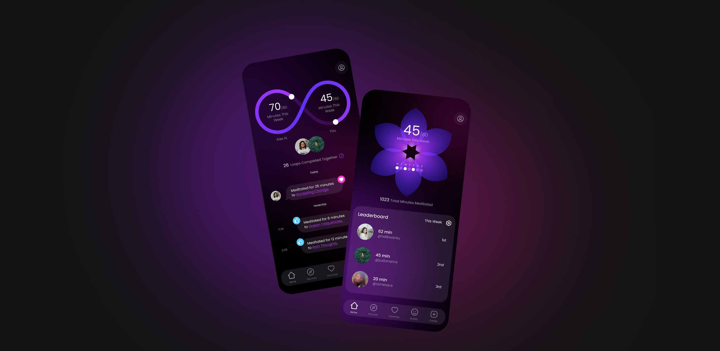
Interflect is a meditation app that leverages aspects of video games and social media platforms to keep you motivated — this includes features such as intricate progress visualizations, user-generated content and an accountability buddy system.
I did this project as part of my UX/UI education at Springboard, a part-time online learning platform. This was my first capstone, in which we were responsible for the entire product design, from research to conception, visualization and testing.
The Problem
Many people who have the intention to make meditation a consistent habit for themselves end up losing momentum and motivation only after a few days into their practice.
The Goal
I wanted to find out why people eventually break their meditation habit and create a mobile experience that will encourage users to stay motivated in multiple ways.
The Solution
Interflect allows users to set weekly goals that animate to elaborate progress visualizations, pairs them with a meditation accountability buddy, and gives them a social platform to create, share, or consume meditation content.
Methodology
To solve this problem, I used the Design Thinking process of “Empathize, Define, Ideate, Prototype, and Test.”
To empathize with users, I conducted research to understand the problem space and user pain points. To define the problem, I synthesized my data and created personas. To ideate, I created wireframes and user flows. Finally, I created a prototype with high-fidelity screens and performed two rounds of usability testing.
Meditation Is Just a Habit
The Science of Habit Formation
Like brushing your teeth, meditation is just another habit, but it’s one that perhaps requires a lot more motivation than most. For this reason, I wanted to focus my secondary research on the science of habit formation as a whole. I picked up a copy of Atomic Habits by James Clear and gave it a thorough read in addition to a few other articles online.
From my readings, effective habit formation can be explained by “The Habit Loop,” which includes:
Implementation plans (cues)
Repetition of tasks (routines)
Rewards
Intermittent Rewards
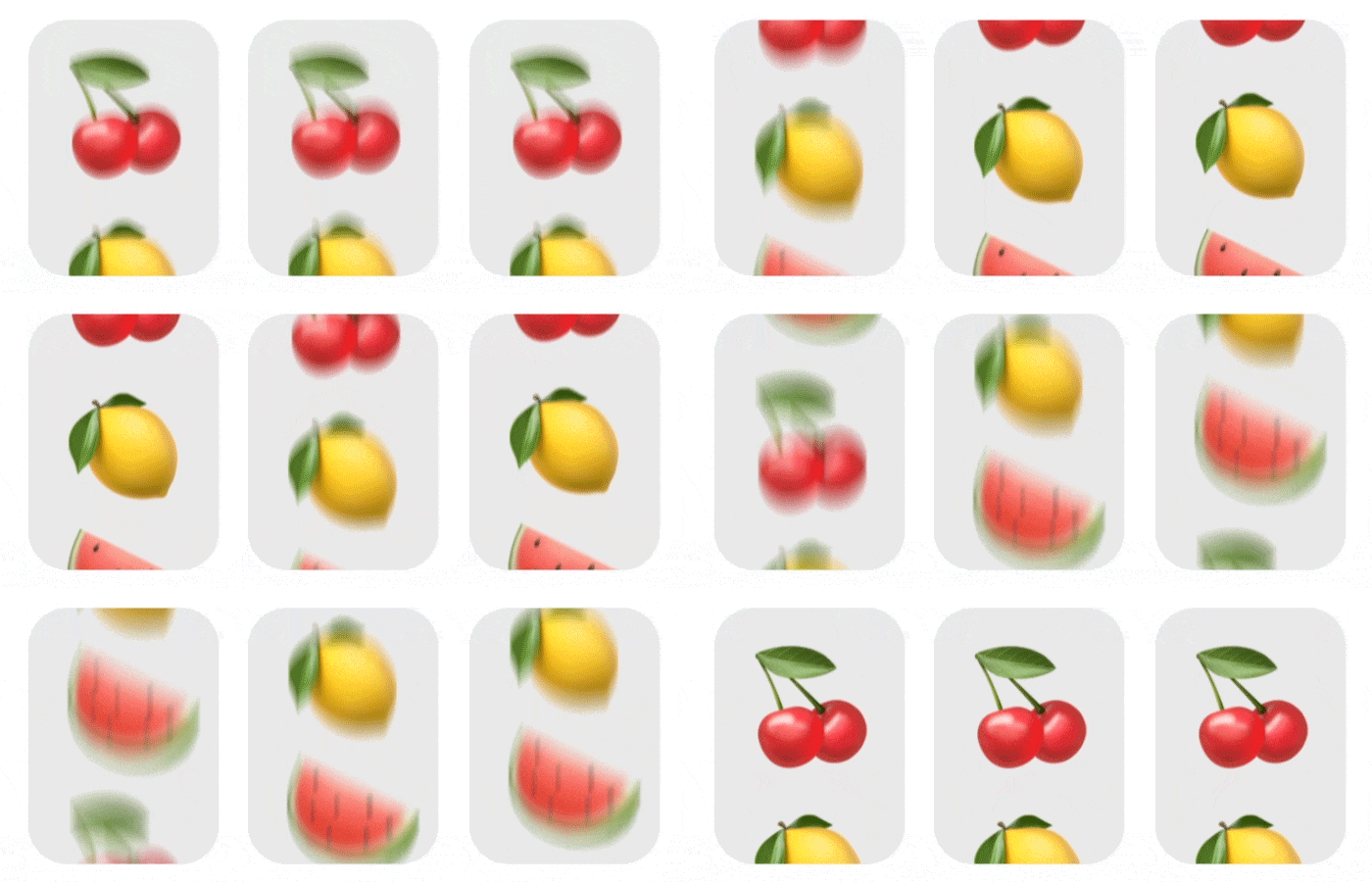
One of the most effective type of rewards in the habit loop are intermittent rewards. Intermittent rewards are randomized rewards given to users after an action is completed — the user never knows exactly what reward they will get each time, similar to how a slot machine works.
Unanswered Questions
Primary Research
My secondary research was insightful, but I still needed to find out who exactly my users were with qualitative data. I wanted to find out specifically:
What are people’s likes, dislikes and wants using apps for meditation?
What are people’s meditation preferences and behavior?
What barriers do users encounter while forming new habits, and what techniques have been successful for them in the past?
User Interviews
I found eight interviewees that all had an interest in mindfulness meditation, had attempted to form a meditation habit in the past, and are familiar with meditation apps.
My Findings
Users liked to view their progress visually.
Key motivators for users were accountability, hand-writing intentions, and an immediate calm feeling.
People want more customization in meditation apps.
Most people enjoyed feeling a sense of community.
The Striving Meditators
After talking with my interviewees, I was able to distinguish very different behaviors and attitudes towards meditation that I synthesized into three different personas:
Nathan Goode, 28
Sees meditation as a tool to enable him to perform better and improve his relationships.
Chloë Saunders, 38
Sees meditation as a path to serenity and enlightenment.
Jules Laurent, 20
Sees mediation as a tool to simply just take the edge off of life’s everyday stressful experiences.
Finding Solutions
Once I determined who my users were, I wanted to begin my ideation with three questions that would be my north star when brainstorming. How might we:
Visualize progress in a motivational and social way?
Provide customizable and dynamic meditation experiences?
Accommodate users who want to feel a sense of accountability and community?
Building Motivation
Borrow From The Best
With my newfound knowledge of habit formation from “Atomic Habits”, paired with my qualitative data from interviewees, I knew that I would need to borrow features from video games and social media apps — these apps are designed with laser precision to keep users connected and engaged. Core features I decided to incorporate were:
User Stories
Before sketching any visual solutions, I wanted to understand what flows would be the most impactful for an MVP. I concluded that the user would need to:
Sign up for an account
Listen to/track meditations
Find an accountability buddy
Mapping it Out
To further elaborate on these user stories, I created a sitemap that provided a framework for those actions to be completed. From there, I made user flows to nail down the exact screens and interations I would need to build.
Testing My Ideas
Quick Iterations
I turned these flows into a paper prototype with iPad sketches. I performed guerrilla testing to get learnings as quickly as possible and see if my flows would make sense to my target users.
My Findings
The prominence of the “Login” button made some users completely overlook the “Sign Up“ link.
Some users wanted clarification as to why the Visual Selection screen was essential to the onboarding.
While trying to listen to a bookmarked mediation, users were thrown off by the “Create” section at the top of the page.
Refining My Screens
Wireframes
I used my learnings from guerrilla testing to create high-fidelity wireframes before building more time-intensive high-fidelity screens.
Design Changes
I made “Login” and “Sign Up” both buttons.
On the “Select Visual” page during onboarding, I made more space to explain why the visual is necessary.
I removed the “Create” section from the top of the “Bookmarks” page and made it its own dedicated page in the nav bar.
I also moved “Profile/Settings” to the upper-right corner of the UI from the nav bar.
High-Fidelity Designs
After making further refinements to the UI in wireframes, I felt comfortable moving onward to my final designs.
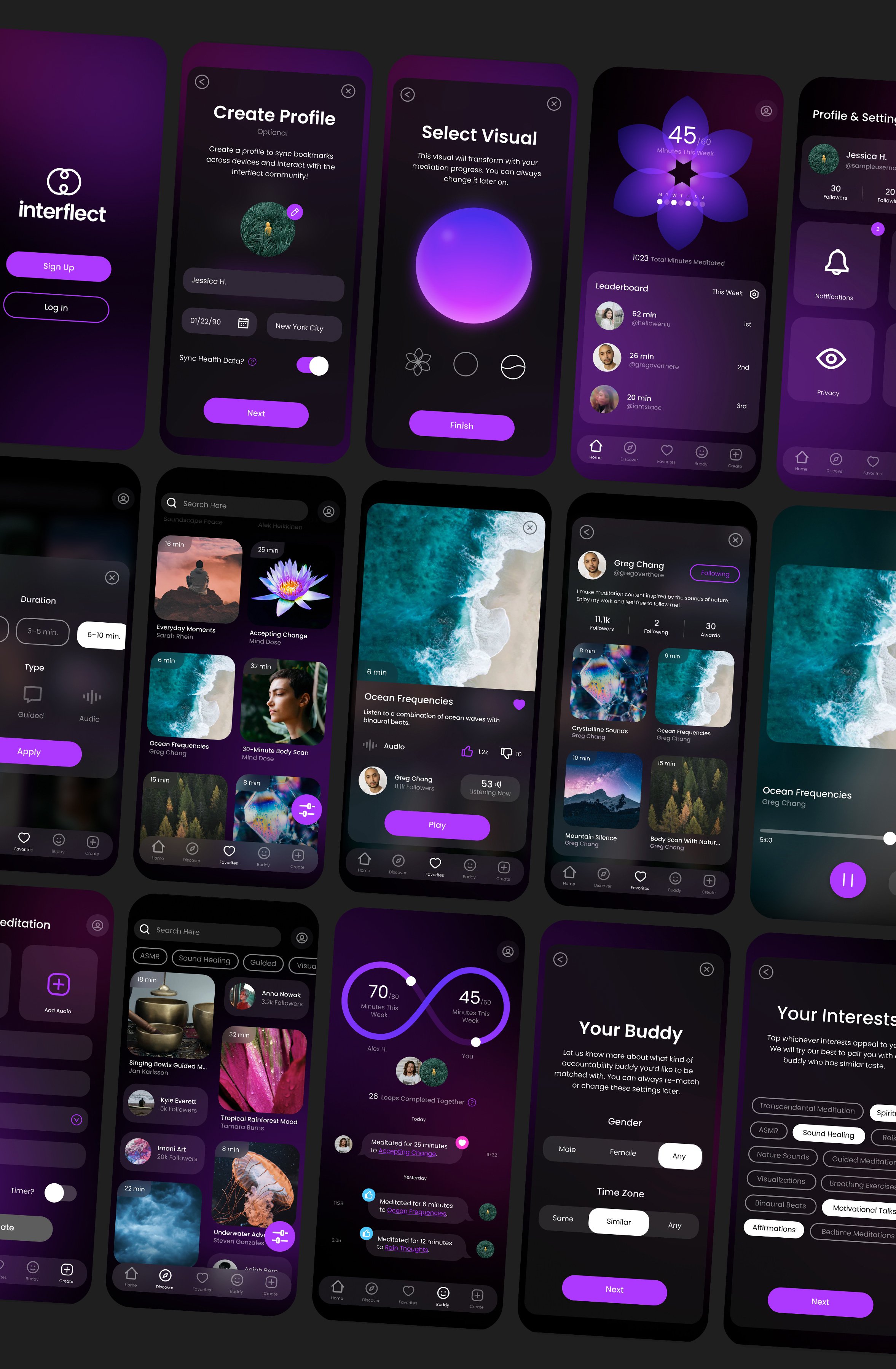
I decided on the name Interflect, and conceptualized a digital wellness universe, pulling together imagery that makes users feel like they’re in an ethereal, dreamlike space.

Interactions & Animations
Screen Interations
I designed interactions so that elements from one page follow into the next. This reduces the cognitive load on the user while navigating.
Progress Visuals
I also created animations for the visual section page, so users would know how each visual transforms as they complete their weekly goals.
Two Testing Phases
Testing Plan
After all my final screens were designed, I conducted two rounds of user testing to see if there were any usability or accessibility issues with my prototype.
I was particularly interested to see:
Would users understand the difference between the Home and Buddy pages?
Would users find the aesthetic calming?
Would users take interest in the progress visuals?
My Findings
Users understood the difference between these two pages, but I found biggest issues were in comprehension. Specifically:
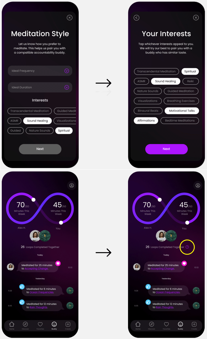
Users wanted to know how the loop visual on the buddy page completes.
Users were confused why interests are relevant when searching for an accountability buddy.
Final Design Changes
I attempted to fix this confusion by adding more context.
I took “interests” off of the “Meditation Style” page during the accountability buddy onboarding and made it its own page with a description.
I added purple tooltips to features that previously confused users.
Conclusion
Although I am happy with the final product, moving forward I will keep in mind that a product doesn’t need every feature under the sun to be successful.
This app did complete the goal of creating an atmosphere that was enticing to users, but as this product is still only a concept, I wouldn’t know yet if it does a better job motivating users in comparison to other meditation apps.
If I were to move forward, I would work with a developer to create an MVP, and have users complete diary studies over the course of three weeks to see their meditation behavior compared to a control group.


